I am a curious and driven designer who believes creativity knows no bounds. To me, design is about exploring new perspectives and crafting captivating experiences that truly resonate.
Since embarking on my design journey in 2024, every challenge has served as a stepping stone to strengthen my problem-solving skills. Today, I continue to push my creative limits, constantly refining my craft to deliver impactful design solutions.
The branding name represents a journey to explore the rich culture of Hong Kong and invites people to learn more about this vibrant city.
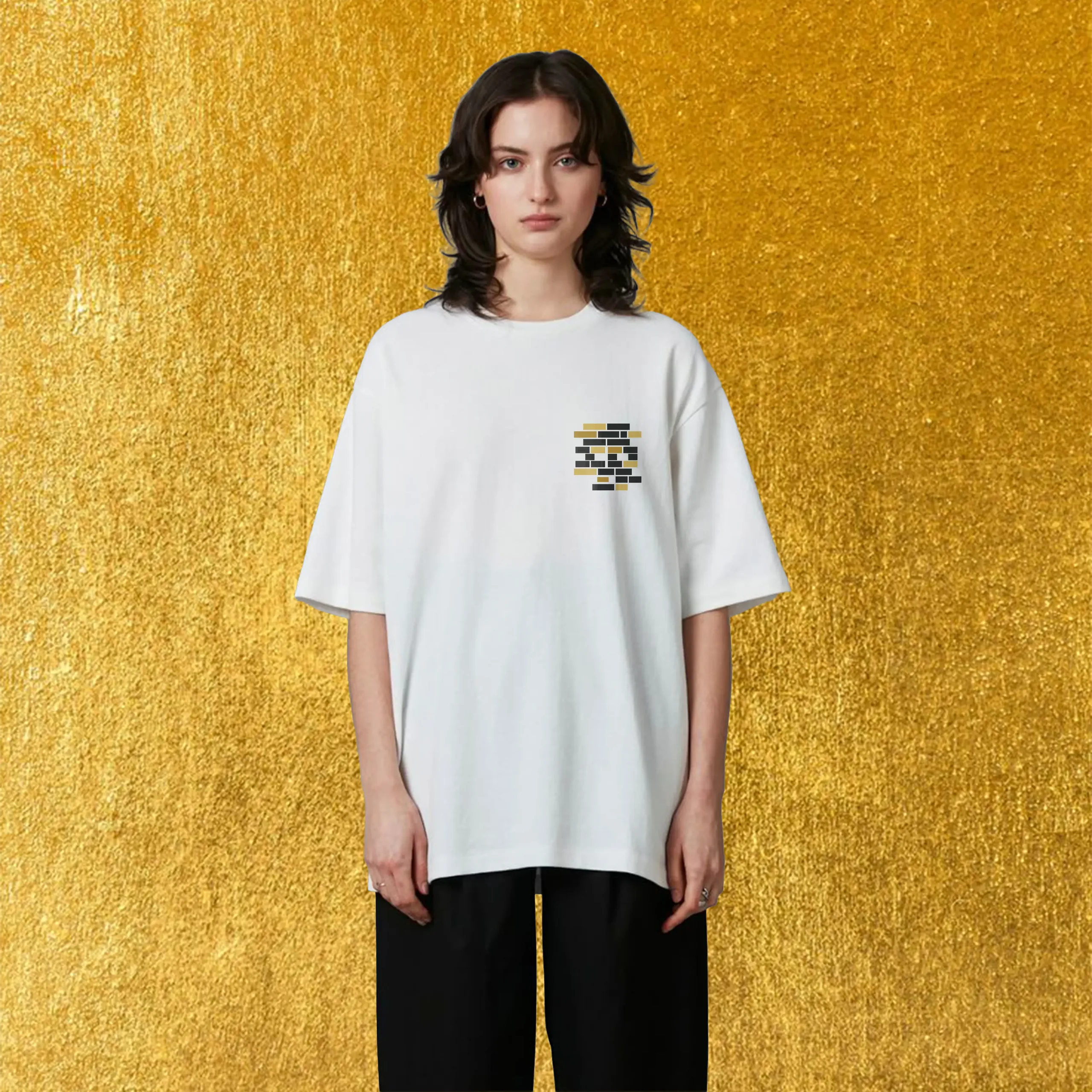
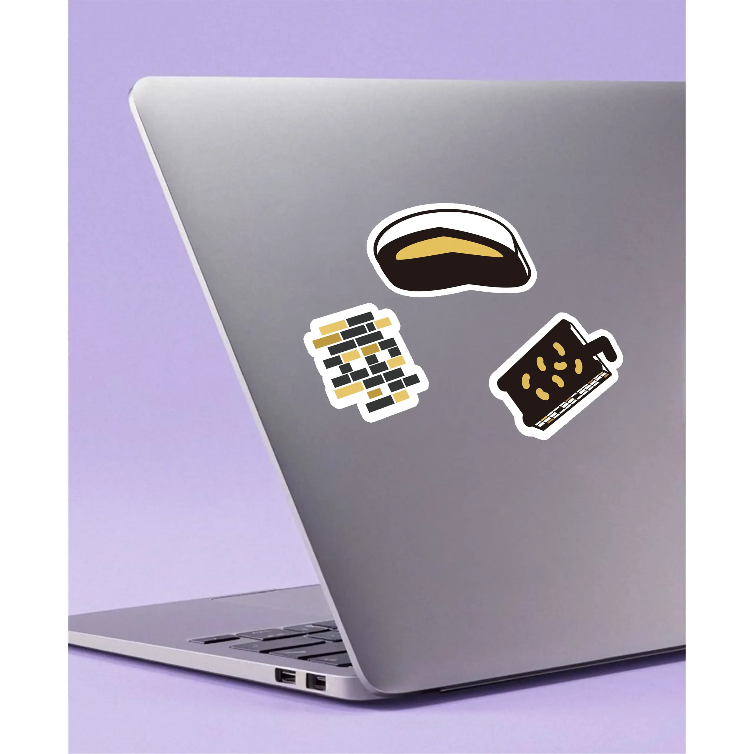
The logo design incorporates bricks, symbolizing heritage buildings, while also featuring black and gold elements as the primary theme for the rest of the project.


This is the part of the “Discover the Hong Kong” branding, designed as a food-themed carnival aimed at promoting Hong Kong's heritage cuisine and dining establishments.
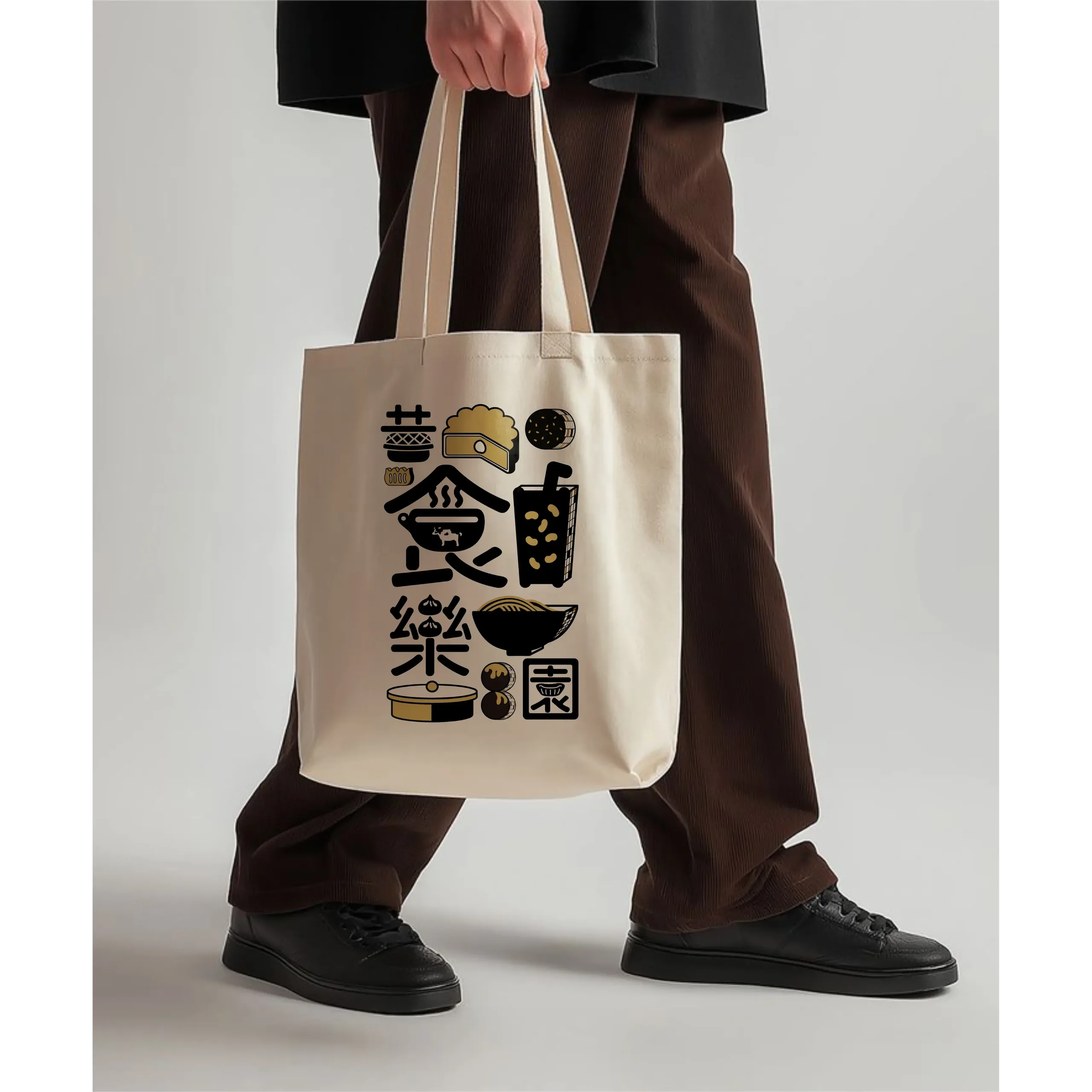
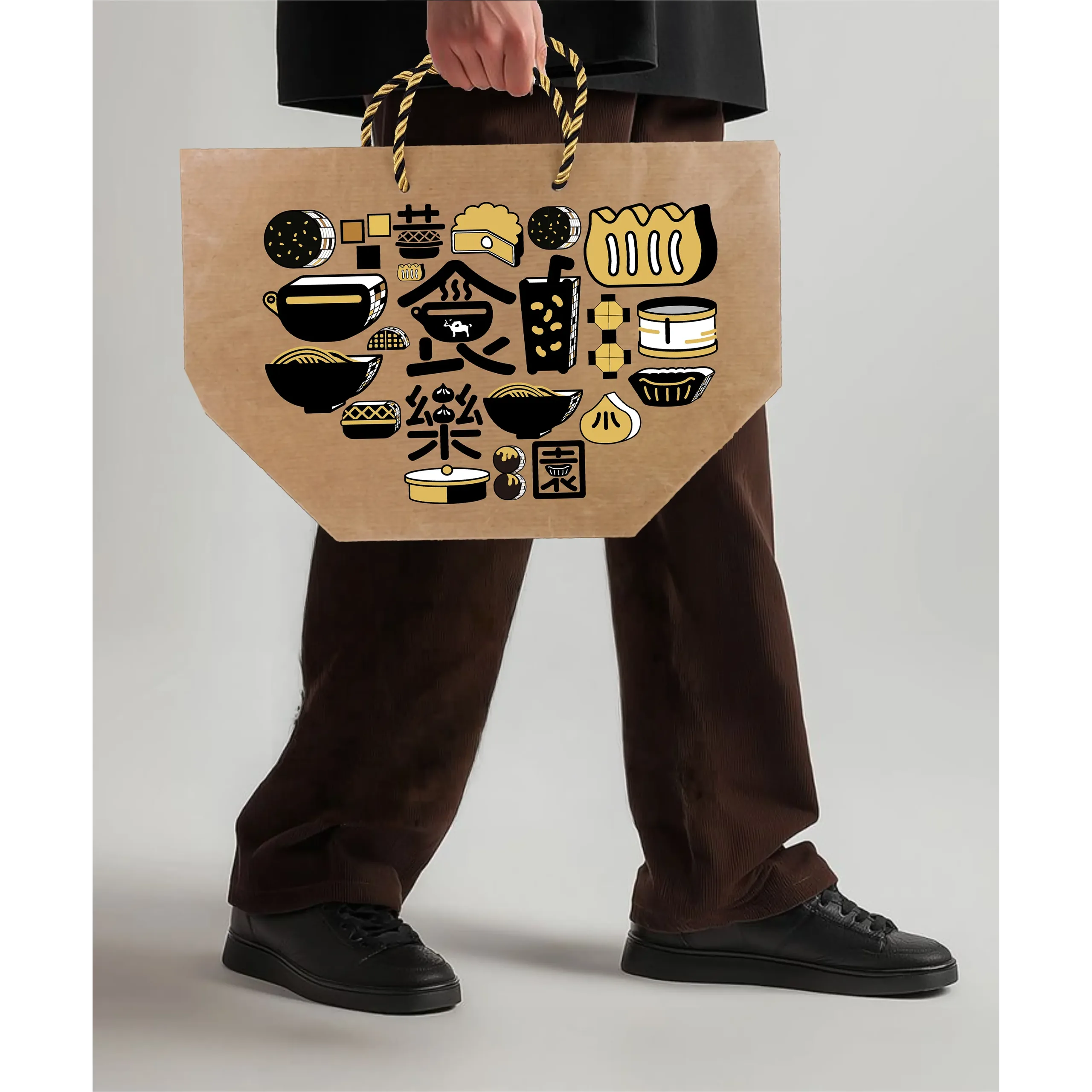
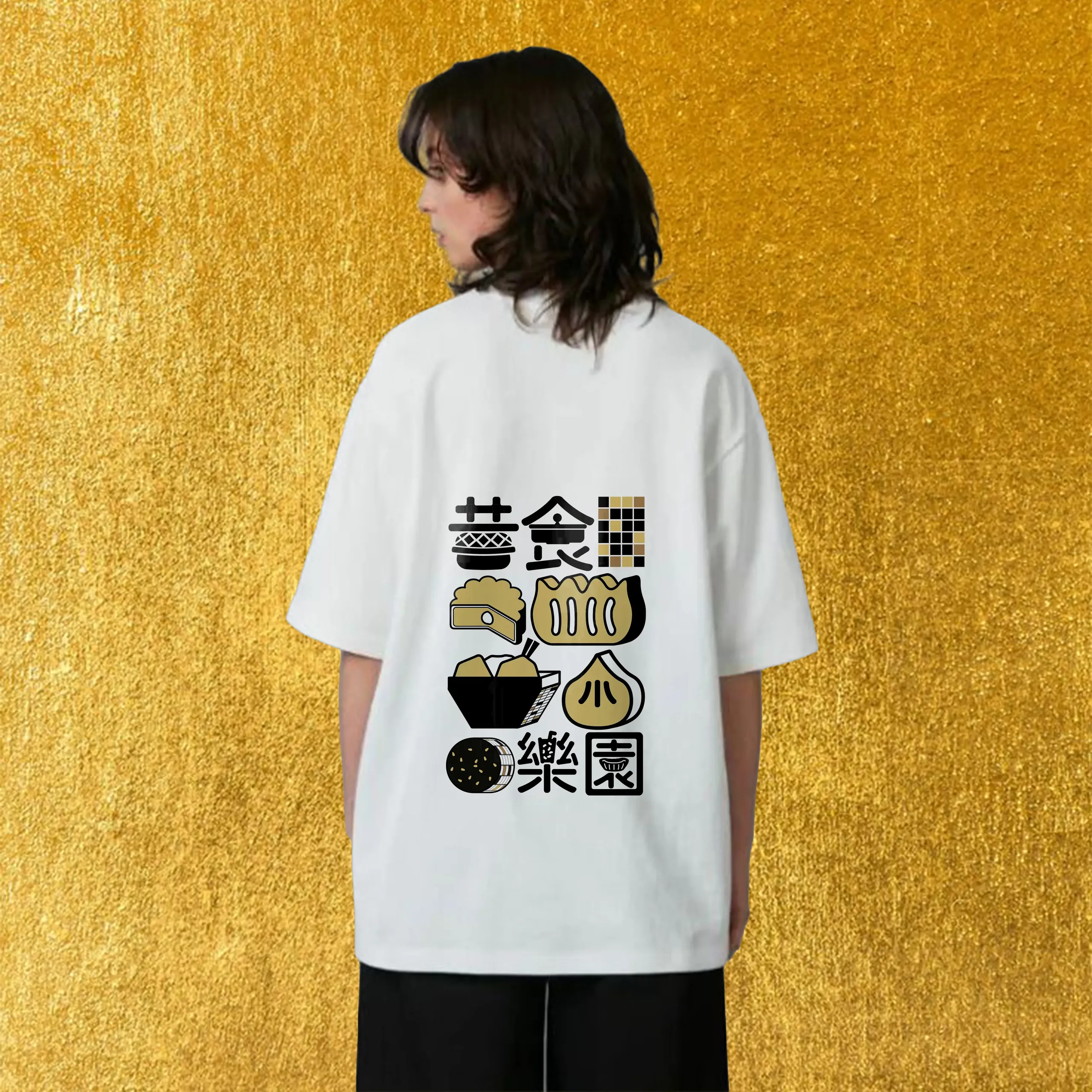
The name incorporates the character “昔,” which signifies heritage, seamlessly connecting it to the culinary offerings. The logo features a distinctive font inspired by carnival designs, creatively blended with images of traditional foods, making it easy for the audience to identify its meaning.




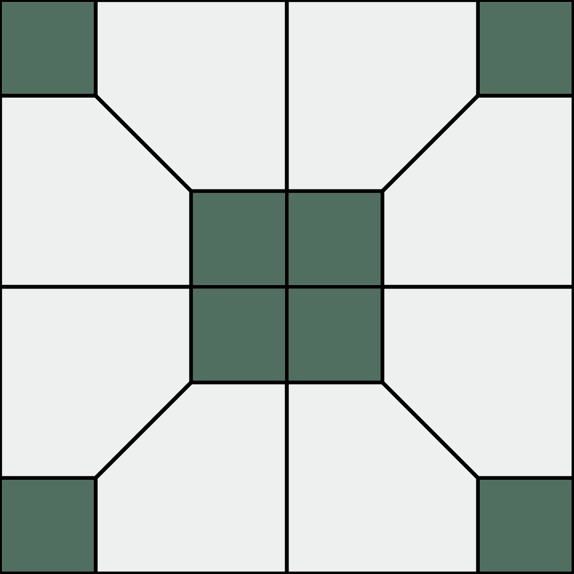
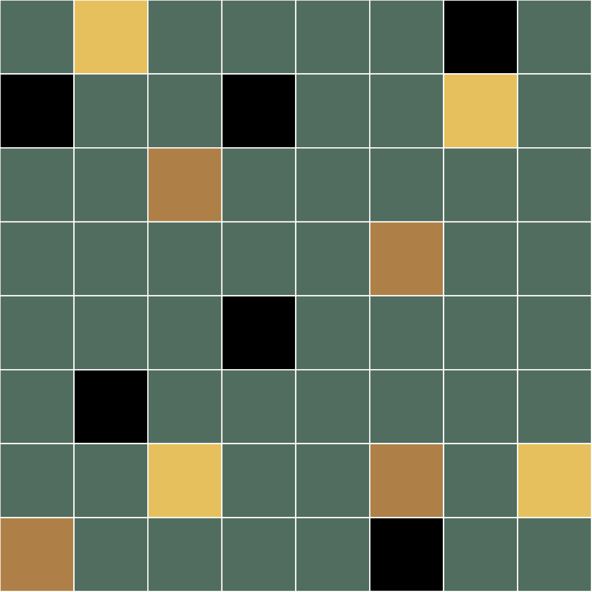
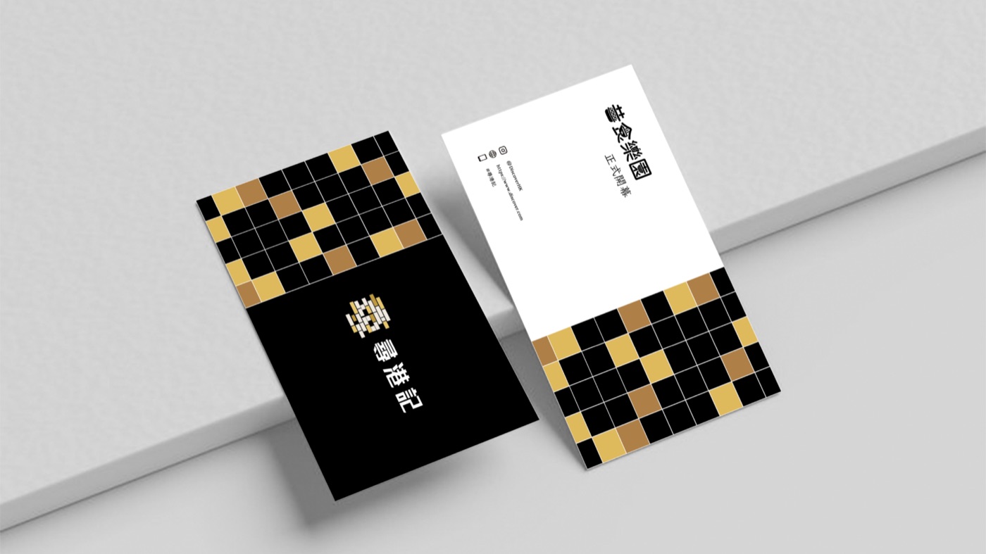
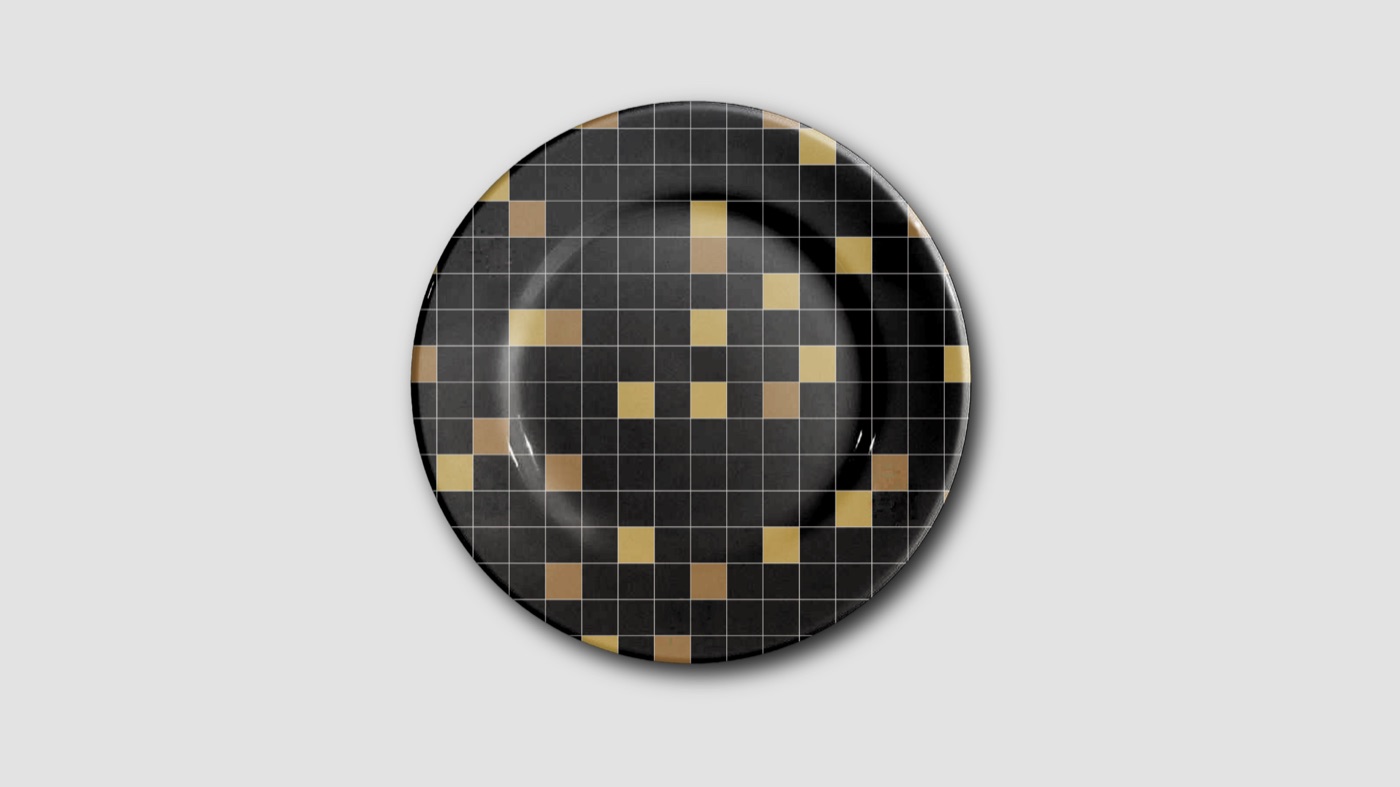
The initial group of patterns showcases the characteristics of a traditional Hong Kong restaurant. This includes classic elements such as the grid floor design. I have incorporated a standard color palette alongside a black and gold color scheme to highlight these features.
The second set of patterns focuses on the black and gold style of Hong Kong heritage cuisine. I have designed 16 unique types of these dishes, each reflecting a distinctive style.




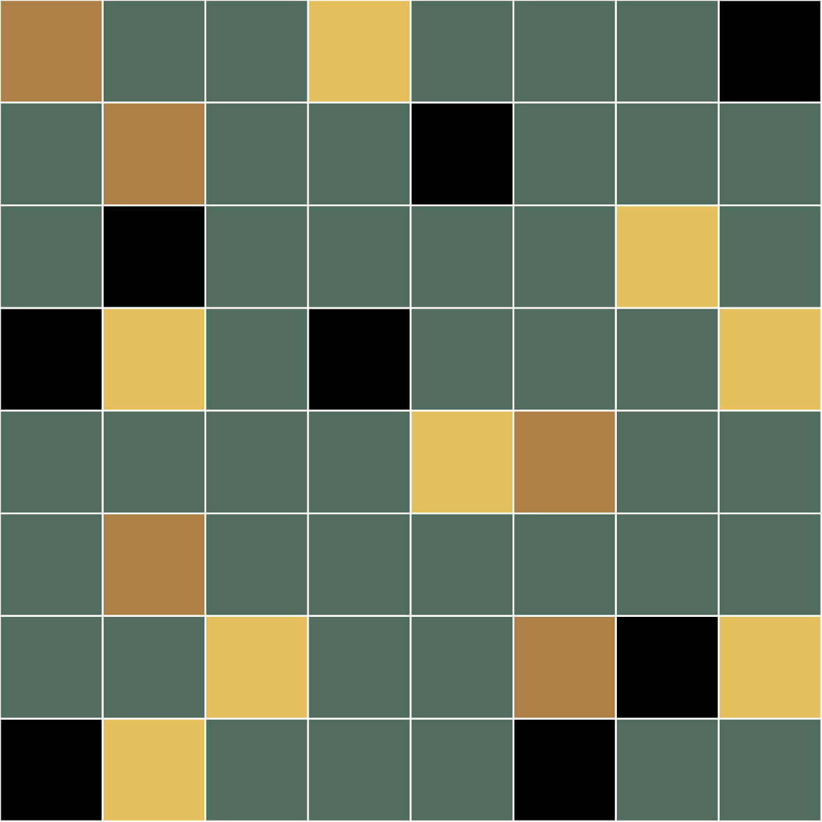

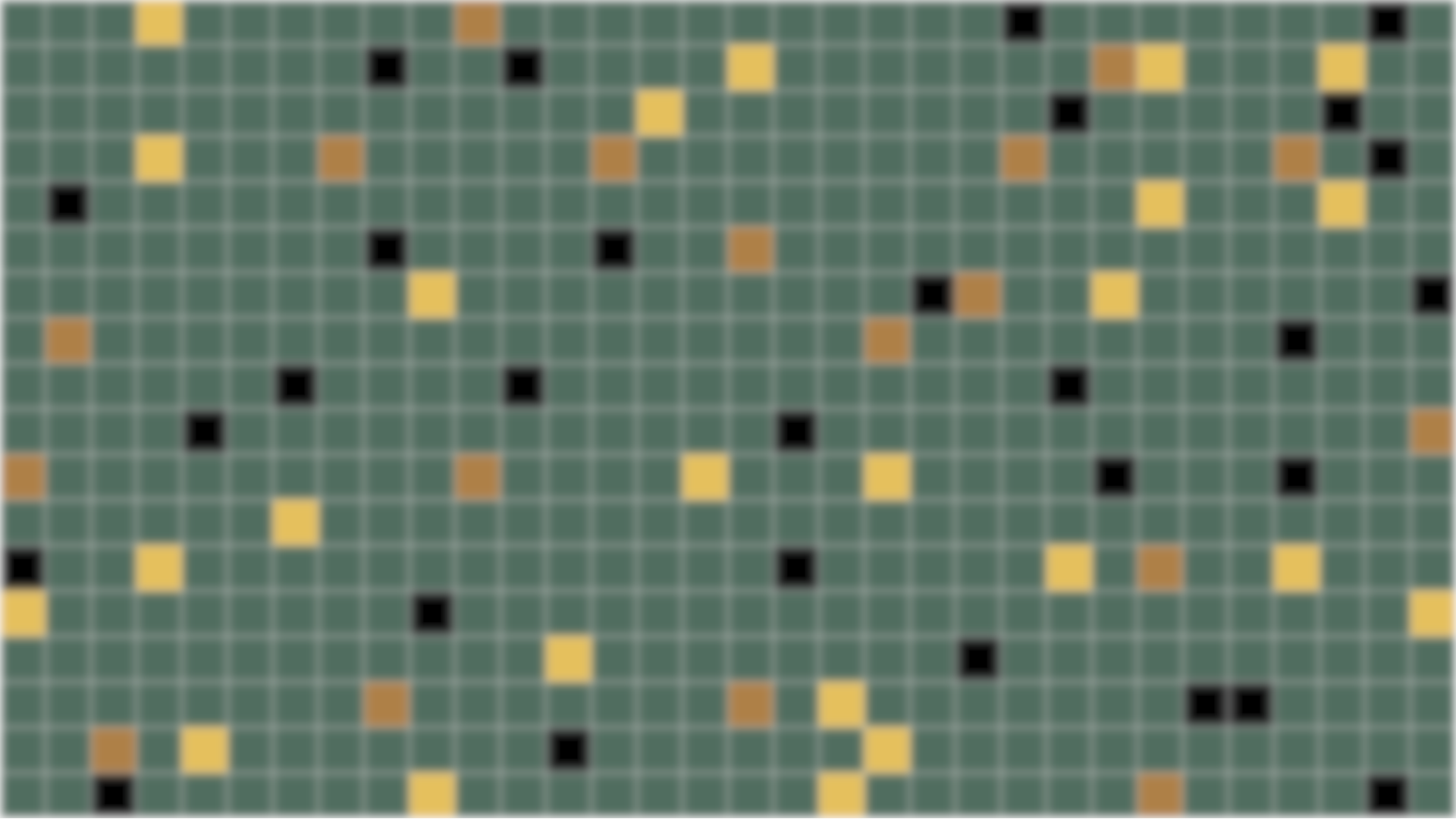


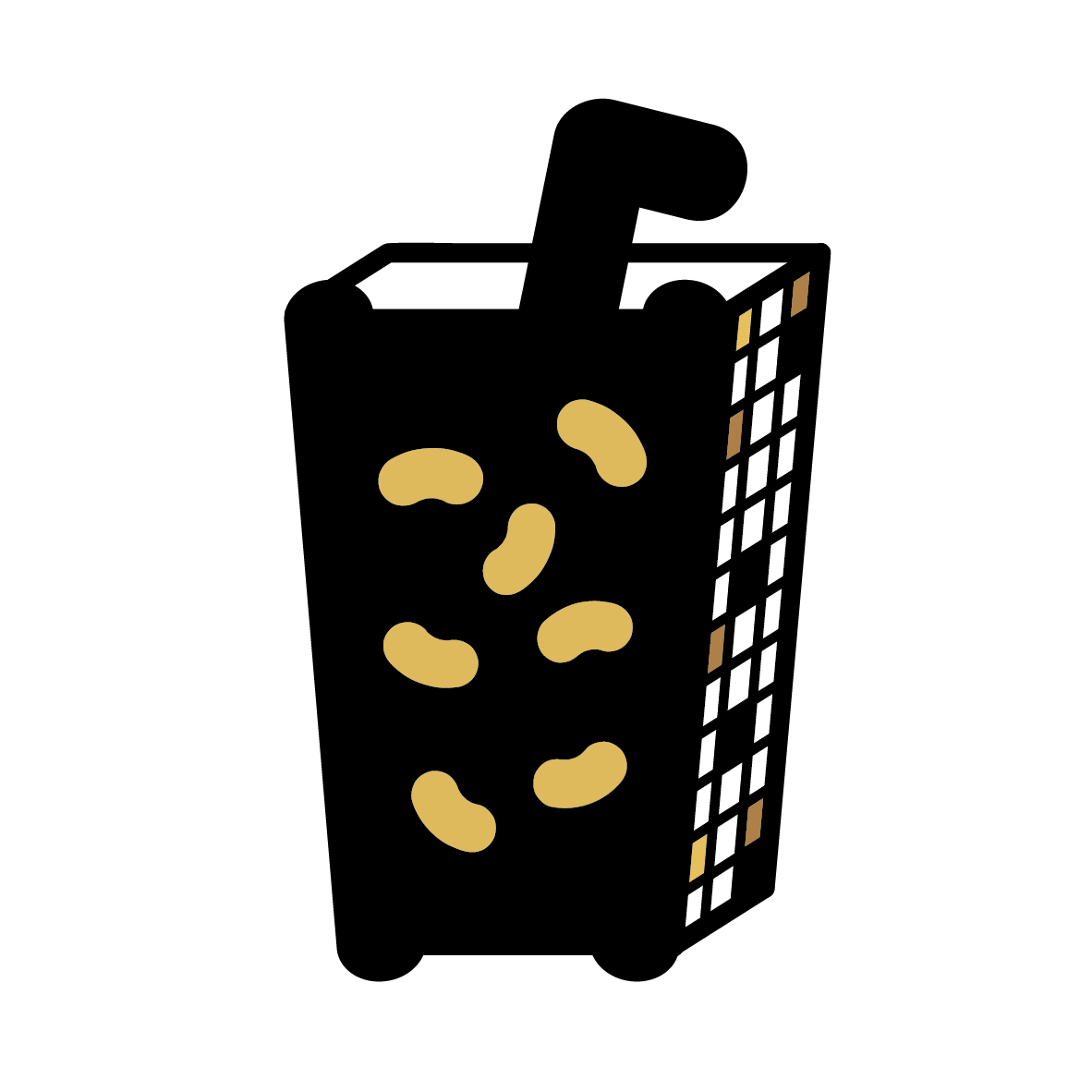



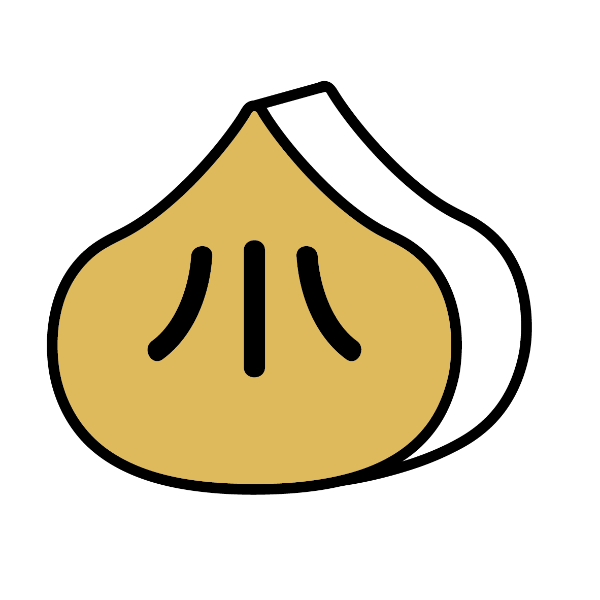








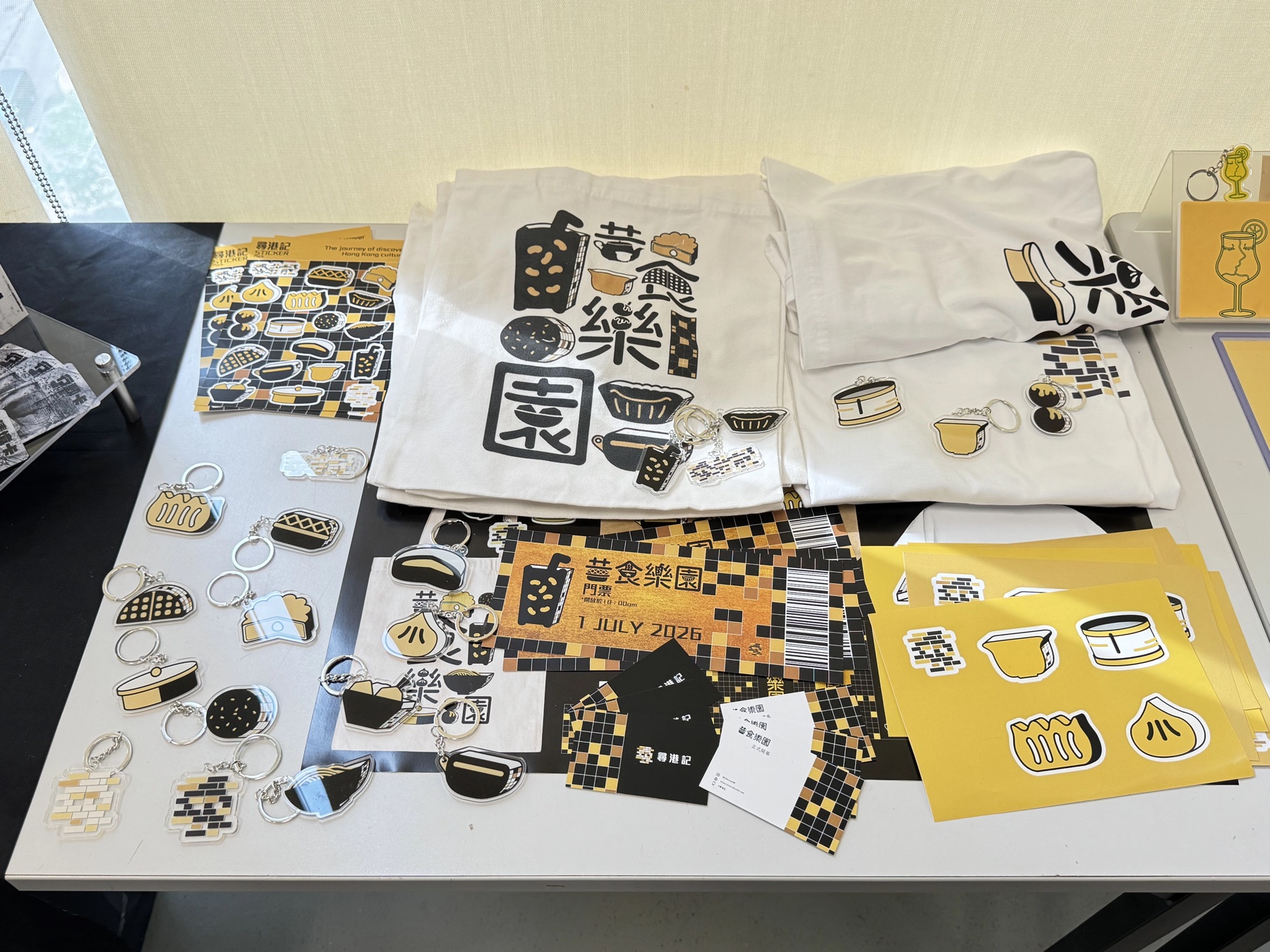
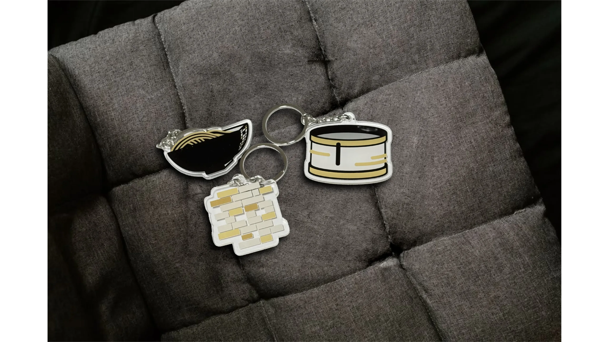
To promote the project, I create a variety of products that share a consistent visual style, including tickets, clothing, and keychains, all of which are showcased on the tables.
These products primarily utilize a black and gold aesthetic along with a heritage grid style to achieve a strong visual impact. For the keychains, I incorporate 16 food patterns along with the project logo to design them.
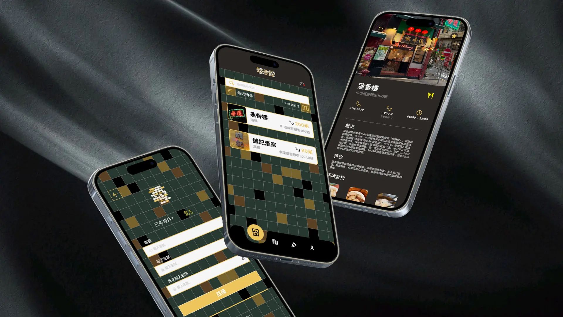
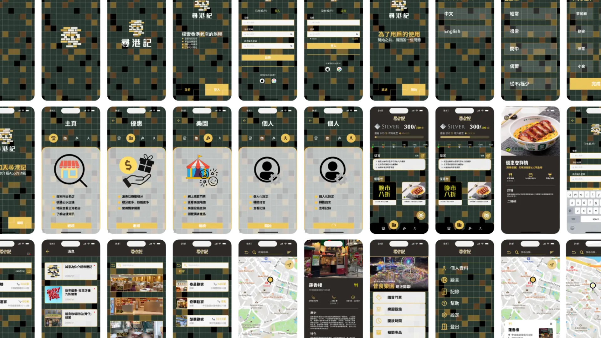
In the UI design, I maintain a consistent style throughout the project. The primary colors of the app are gold and black, complemented by a black gold grid background. To enhance user engagement, the app includes transition animations that add an interesting touch.
This app enables users to interact with heritage shops. Users can search for shops, learn more details about them, and benefit from a scoring system that encourages frequent visits. Additionally, before users begin their journey, there will be a brief introduction and a series of questions to better understand their needs and preferences.
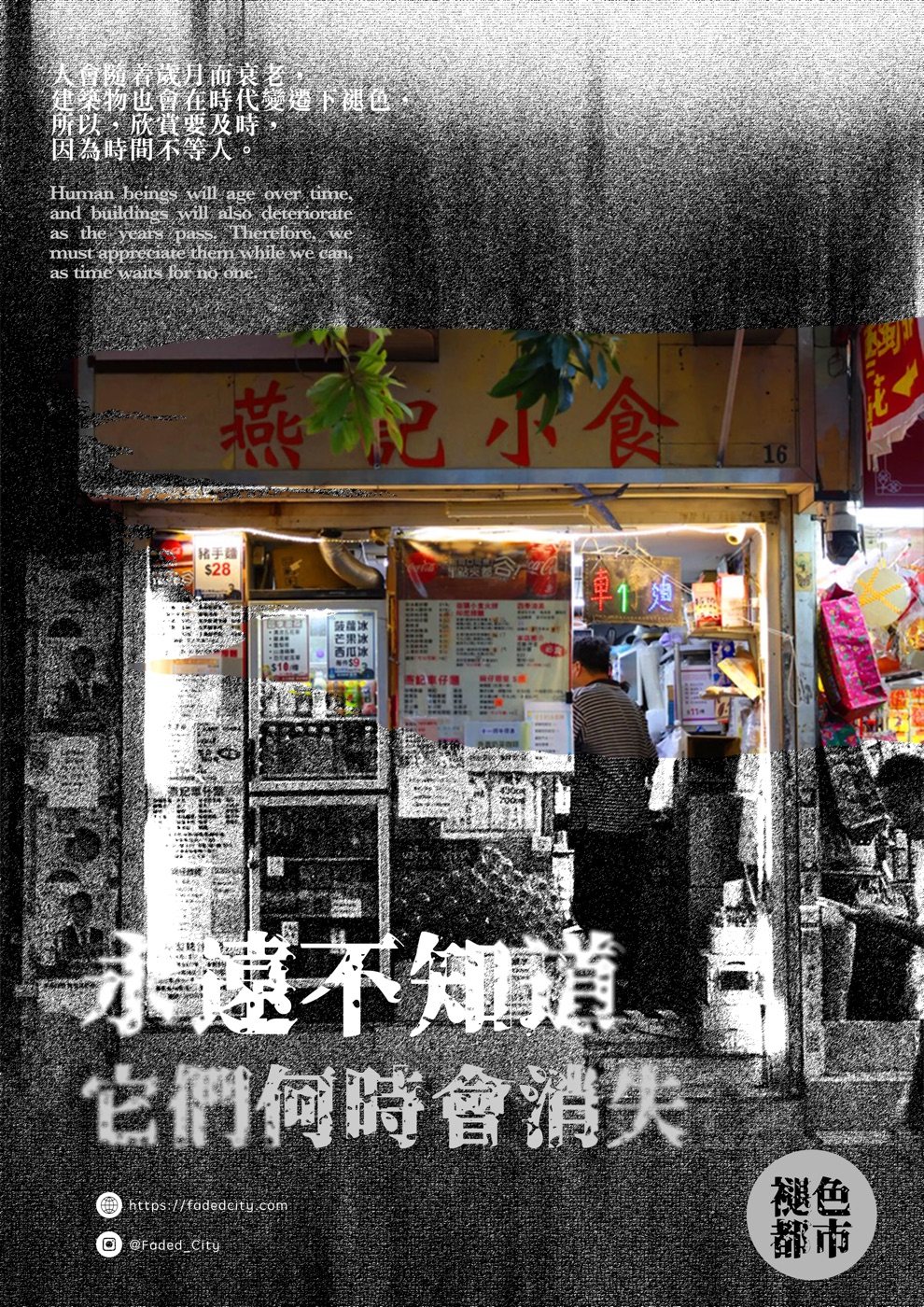
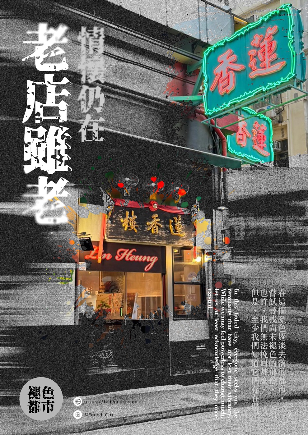
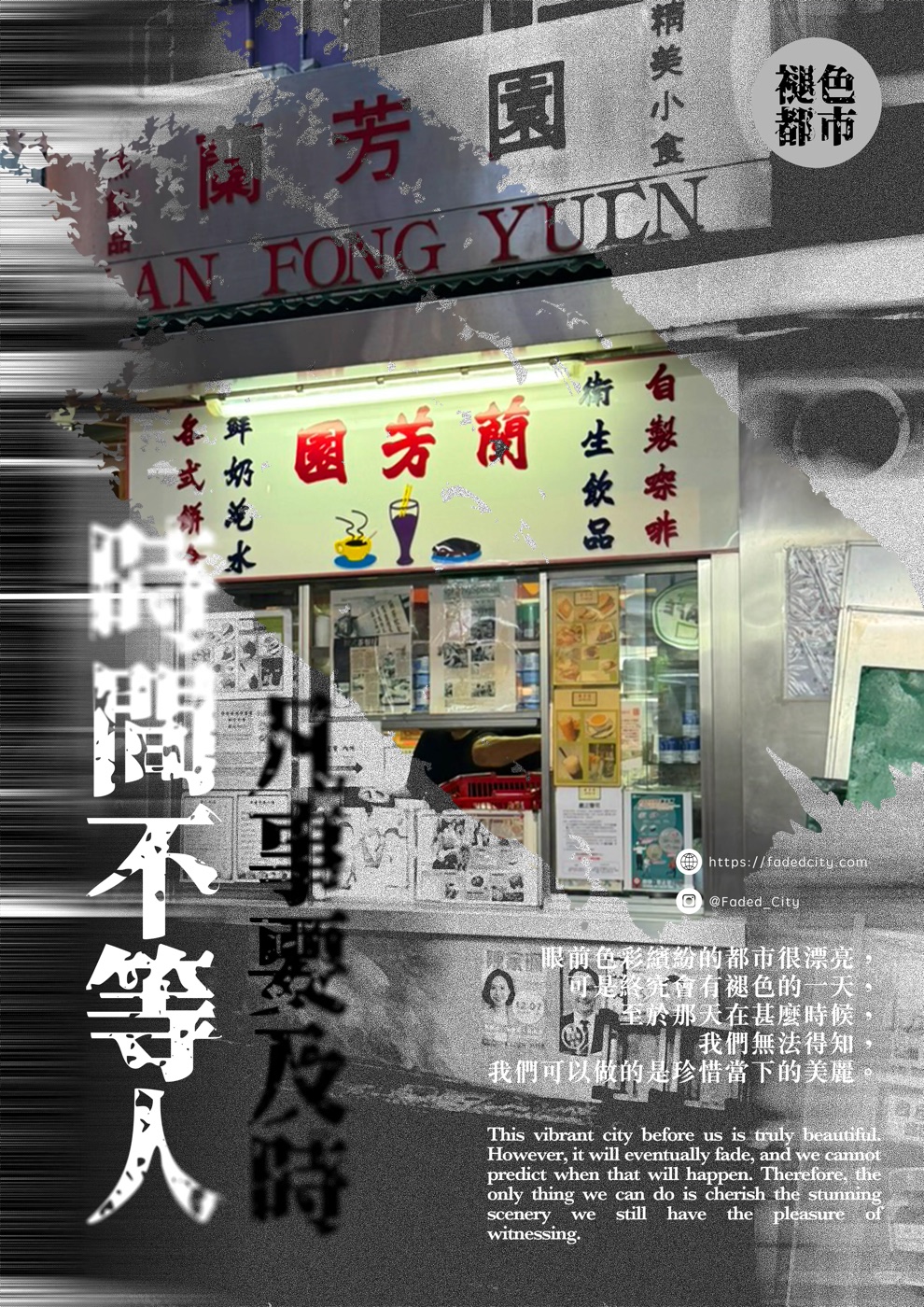
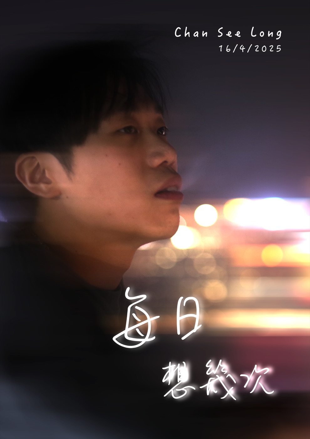
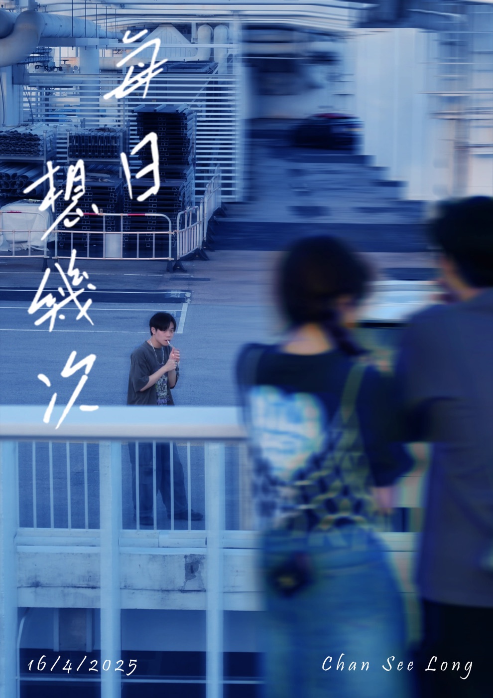
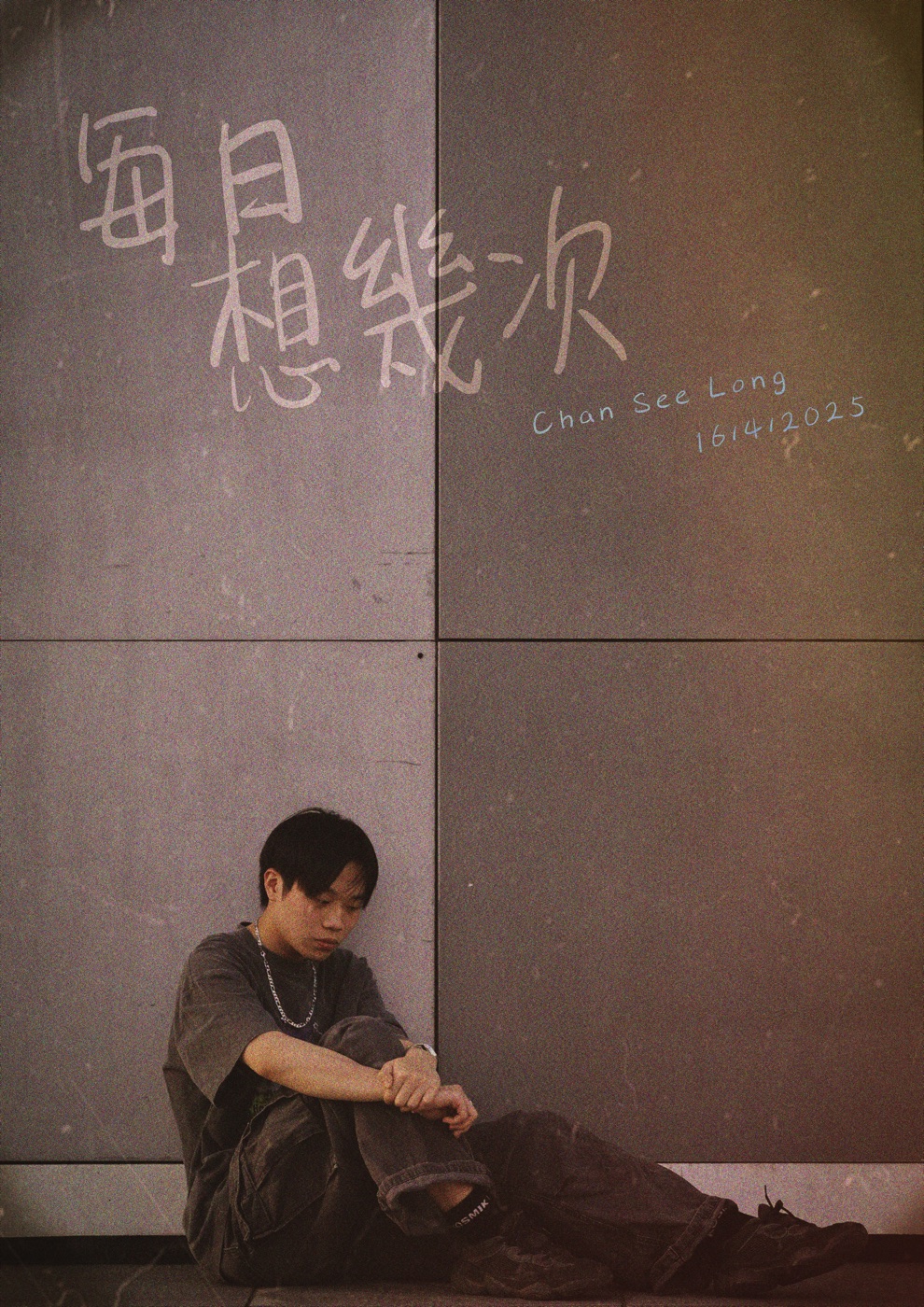
Adapting the layout from poster scale to a smaller album format, I optimized the typography and composition to ensure maximum visual impact for close-up viewing.
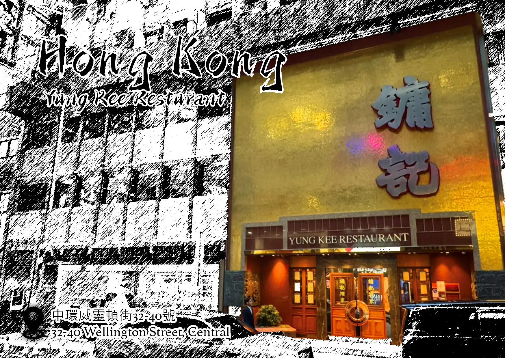
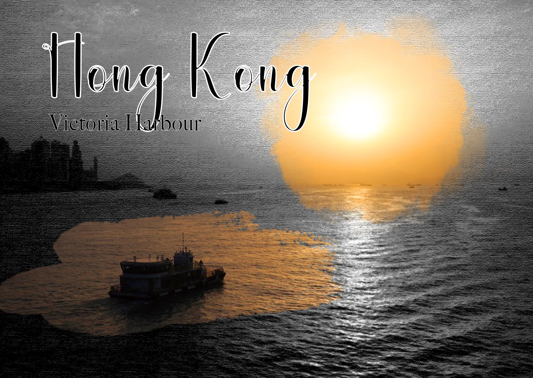
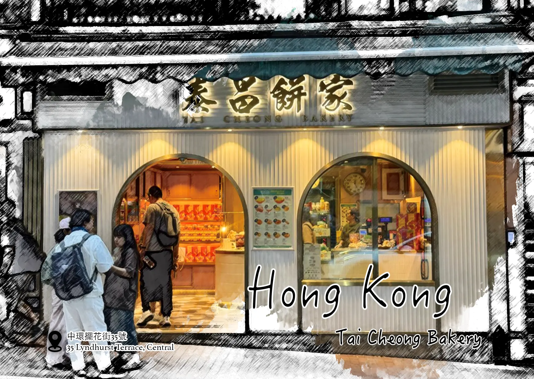
The design of the front of the postcards closely resembles that of the posters, featuring a black-and-white style with a faded effect that highlights parts of the vibrancy of the heritage shop.
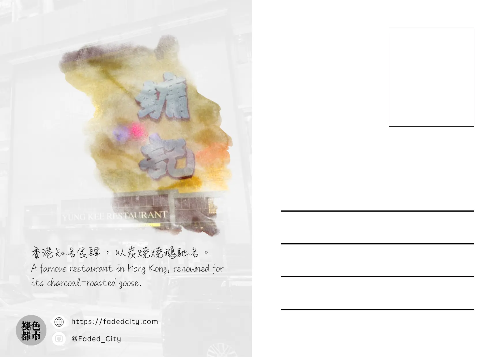
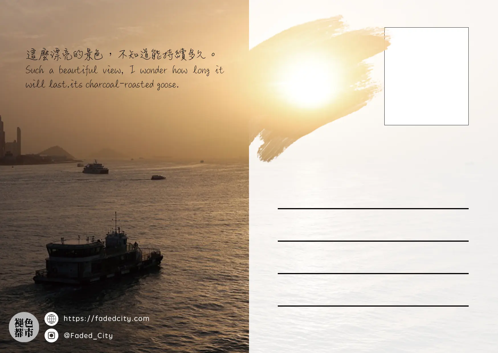
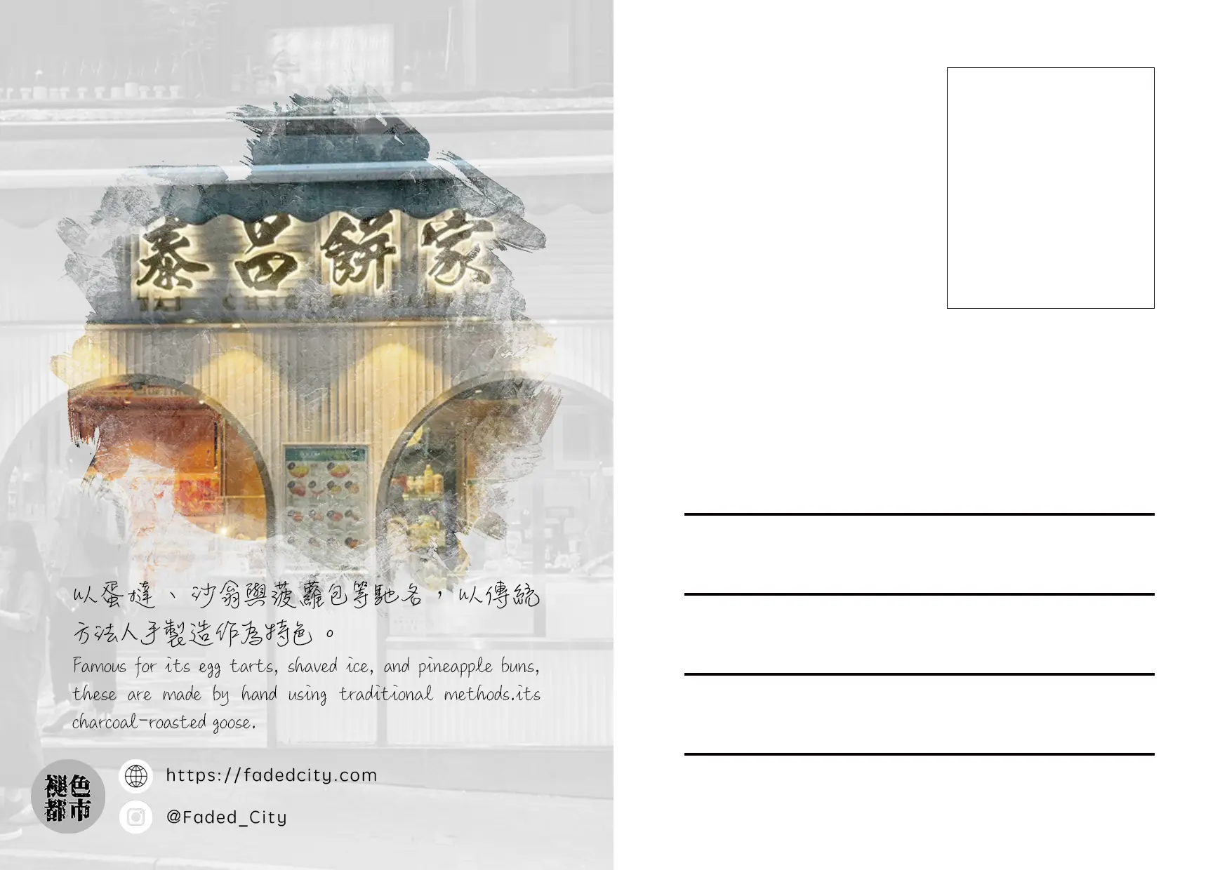
On the reverse side, the design follows the traditional postcard format while incorporating heritage-themed words to share the shop's story.
Inspired by the architectural backdrop of Kowloon Walled City, I constructed a multi-layered paper shadow box by separating character and environmental elements.
The piece brings McDull and his mother's journey to life through tactile depth and detailed framing.
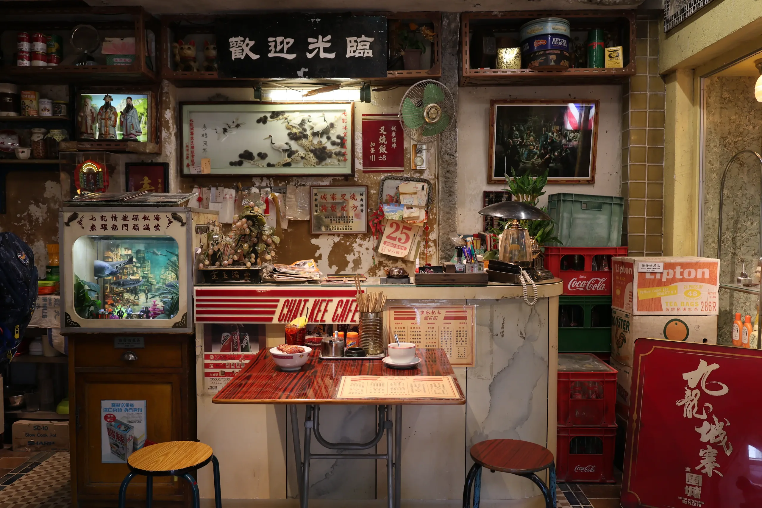
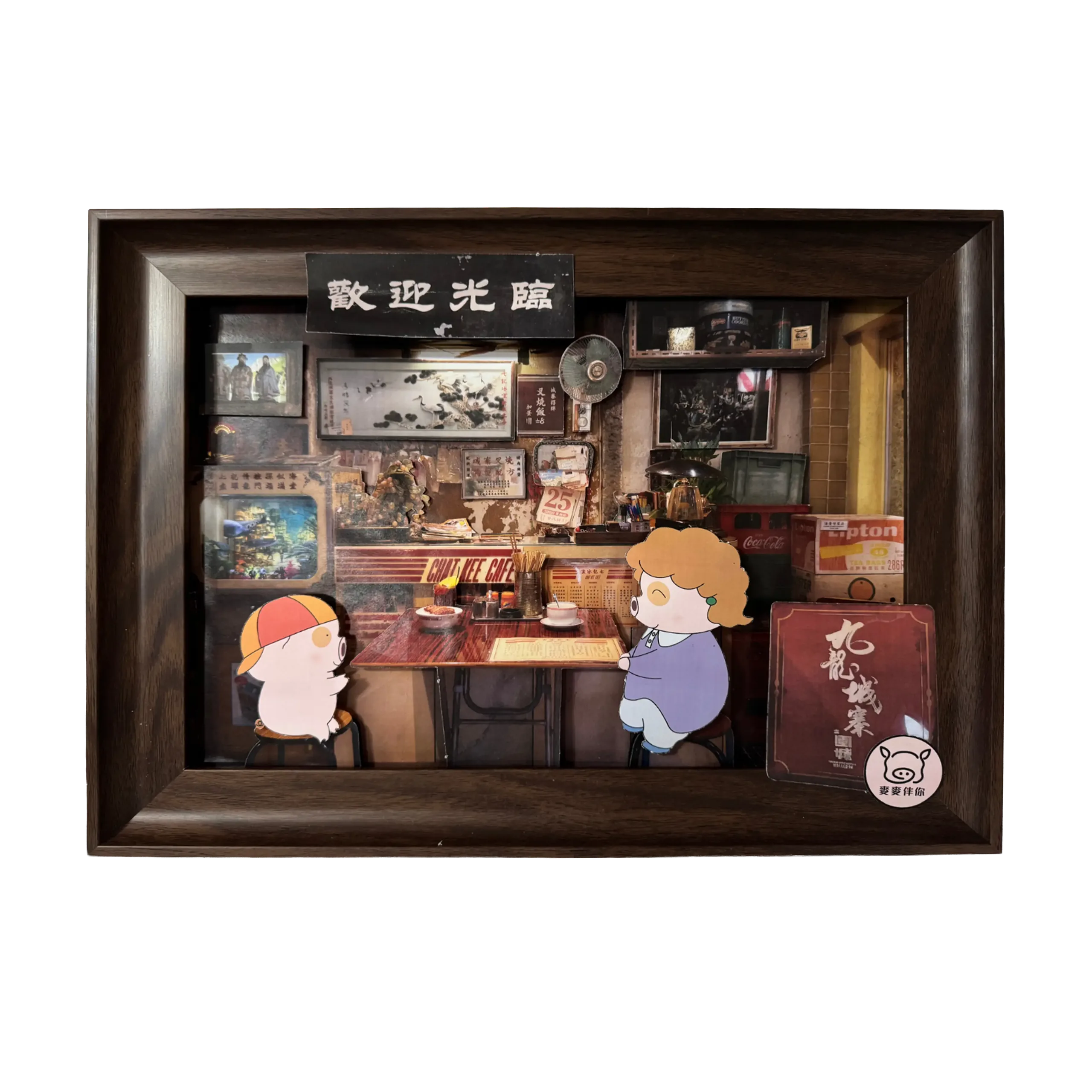
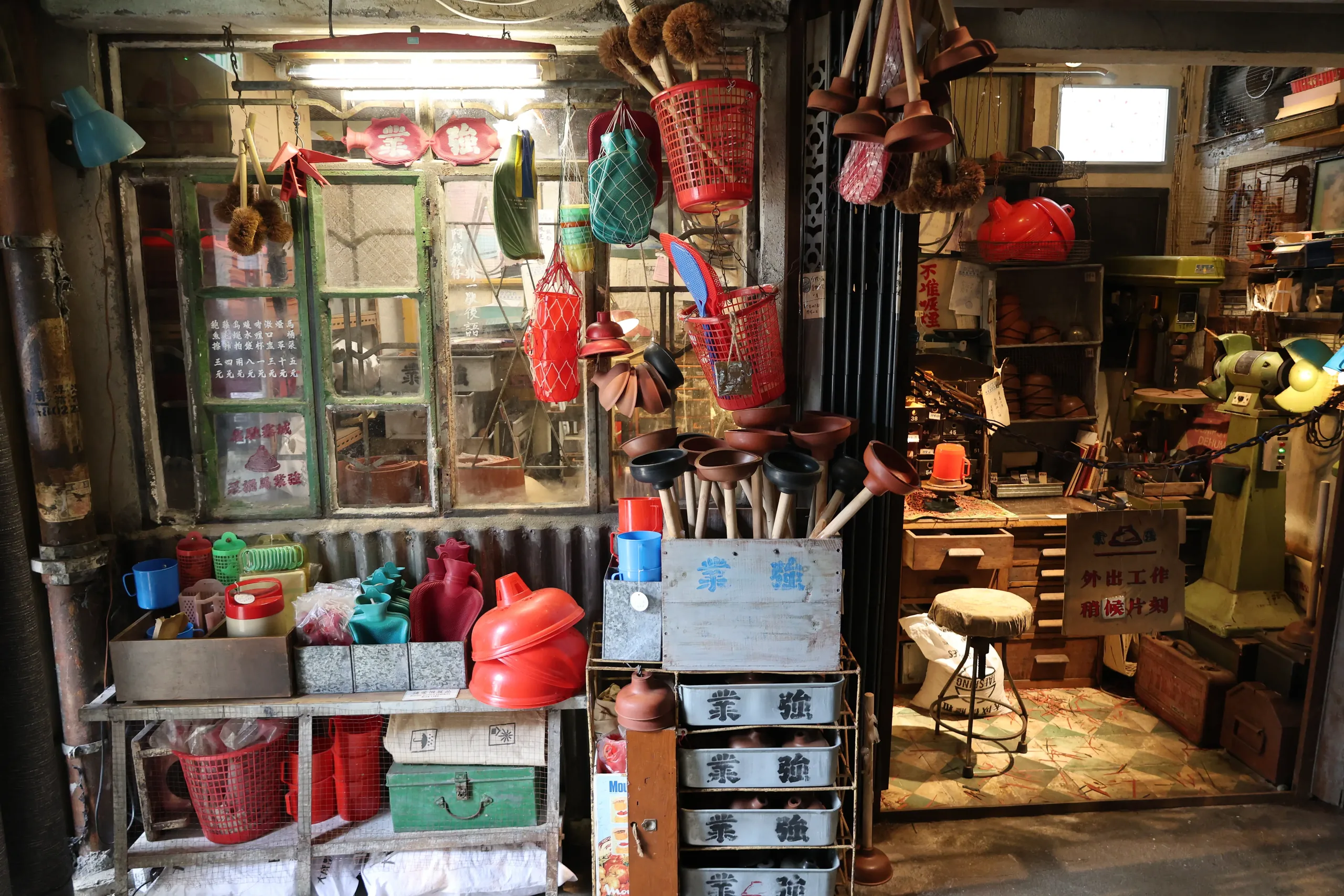
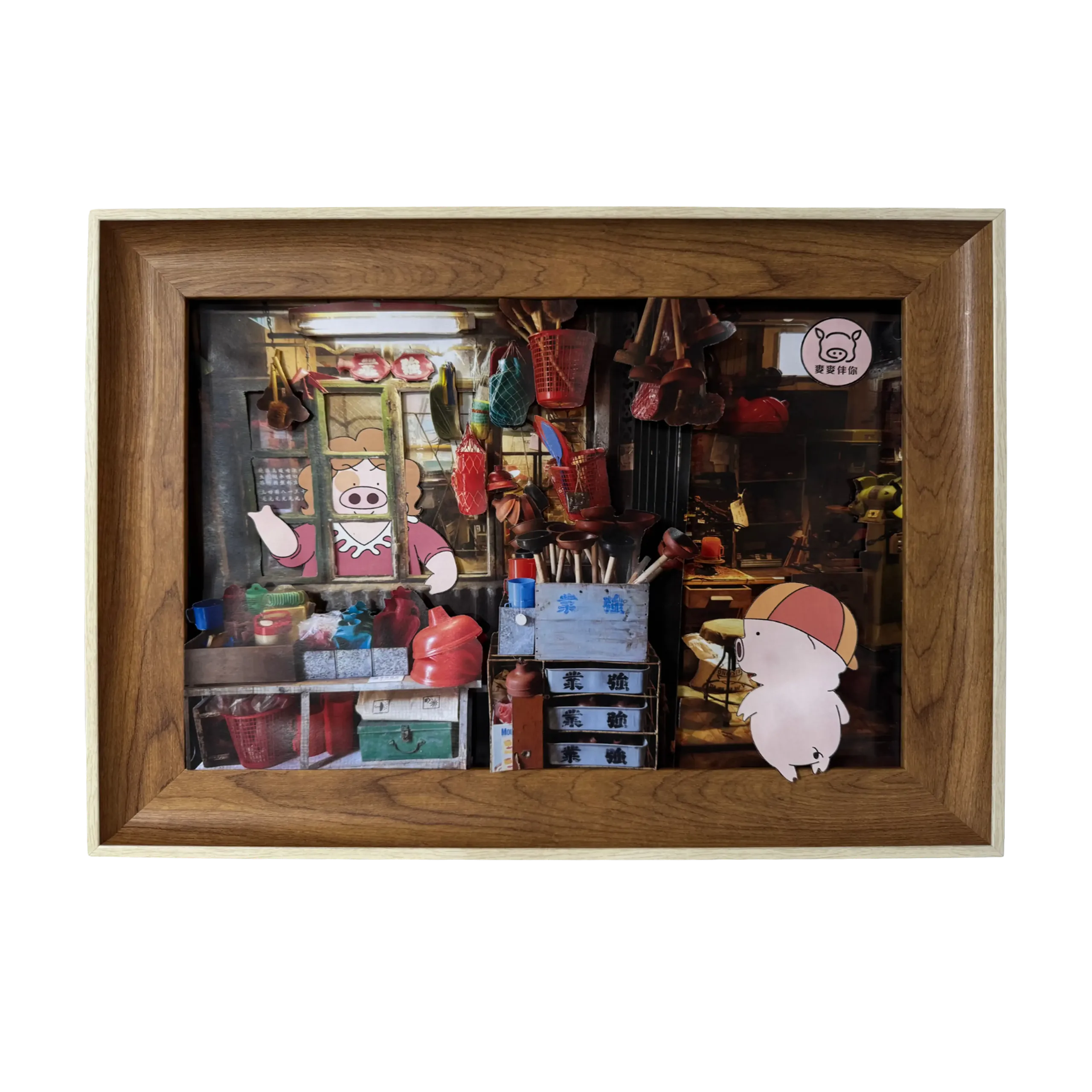
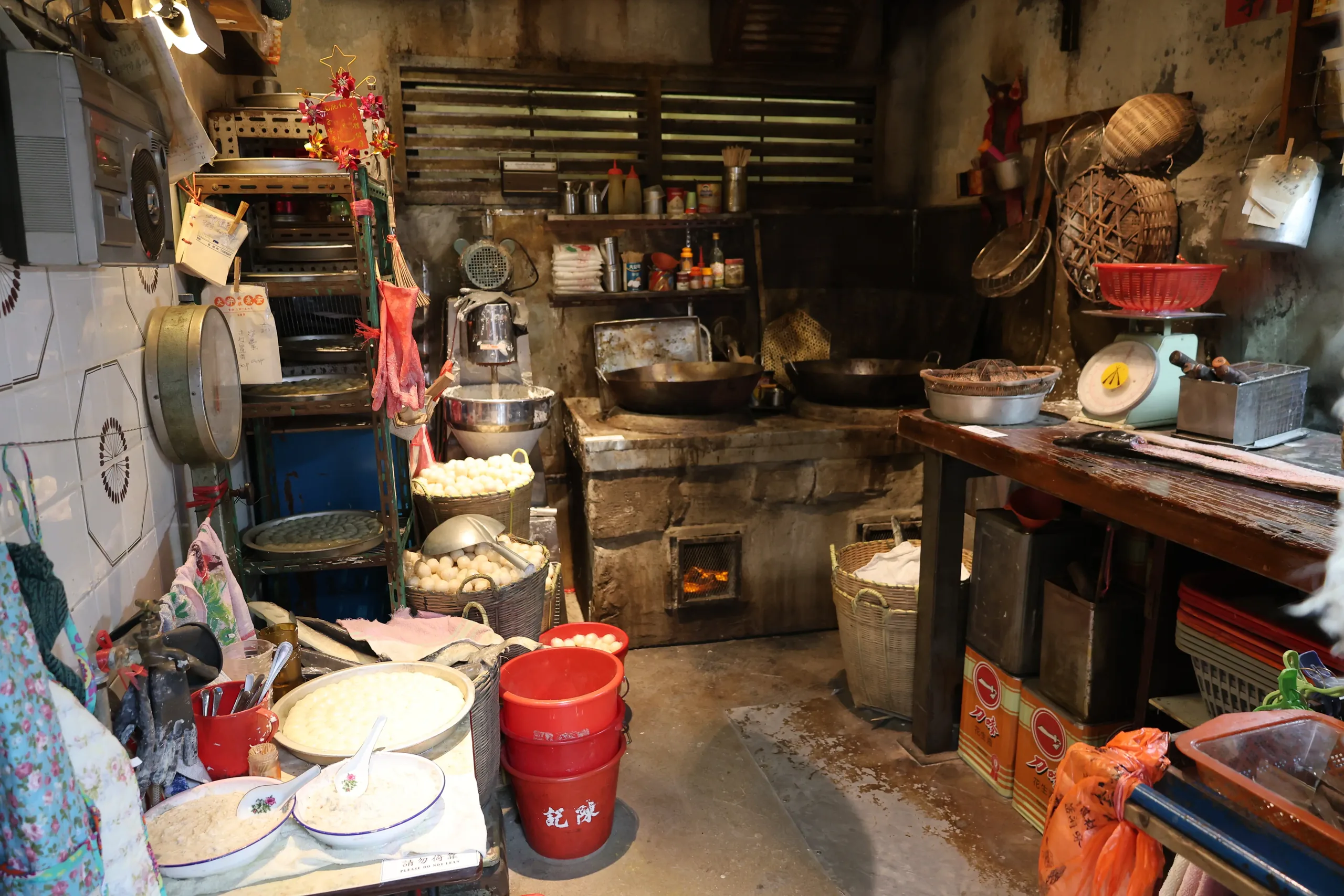
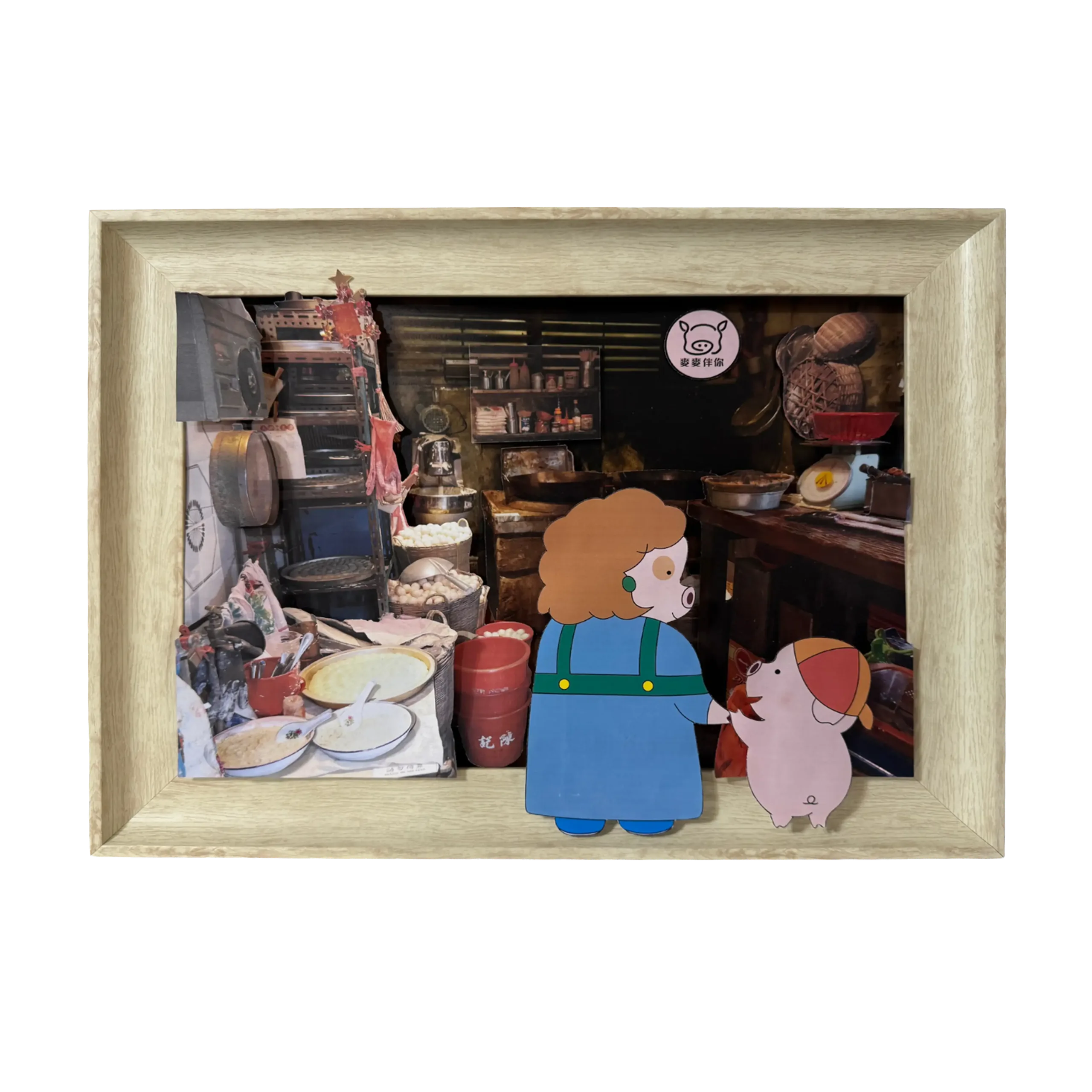
By the comfort of lifelong companionship, 'McDull With You' (《麥麥伴你》) reflects the familiar presence of McDull in our childhood memories.
The logo distills McDull's signature features into simple, elegant line art that perfectly aligns with the brand name.